Press Association Rebrand
In 2018-19, I led the design on a major rebrand for the Press Association (Now PA Media Group) to mark its 150th year, and to officially assert itself as a multi-faceted media company as well as the UK and Ireland’s national news agency.
Website
As part of the overhaul, a new website was required.
Visual Style Guide
Here are a few select pages from a much longer and highly detailed brand style guide I created for the company.
The process: the rebrand explained
Below I will provide more information on the work involved in the project
Workshops
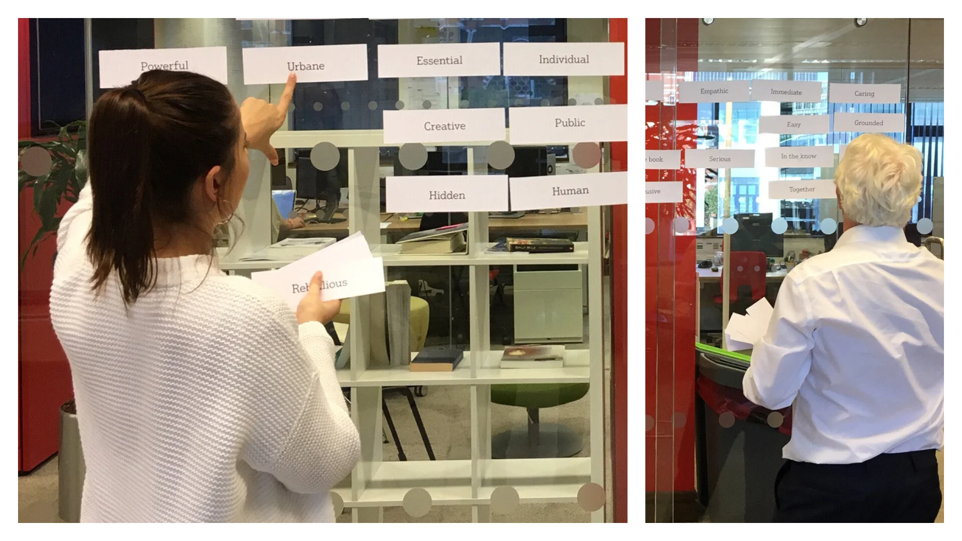
Before any design work could begin, it was essential that I gained an understanding of the company’s values and how it’s perceived.
To do this, over the course of three weeks I held 40 separate comprehensive workshops with individual employees of the company, ranging from board-level to junior.
Mood boards
Mood boards were created off the back of the results of the workshops and other research carried out, to help identify a visual direction to take with logo design.
Initial drawings
Once it was decided that a pictoral logo type was best suited, I began to draw shapes based on the visual themes gleaned from the mood boards.
The logos
These are the final four logos for the group.
The logo explained
The colours
The group’s competition was placed around a colour wheel based on logo colour. This helped to inform the the colour selection for each business unit.
Execution
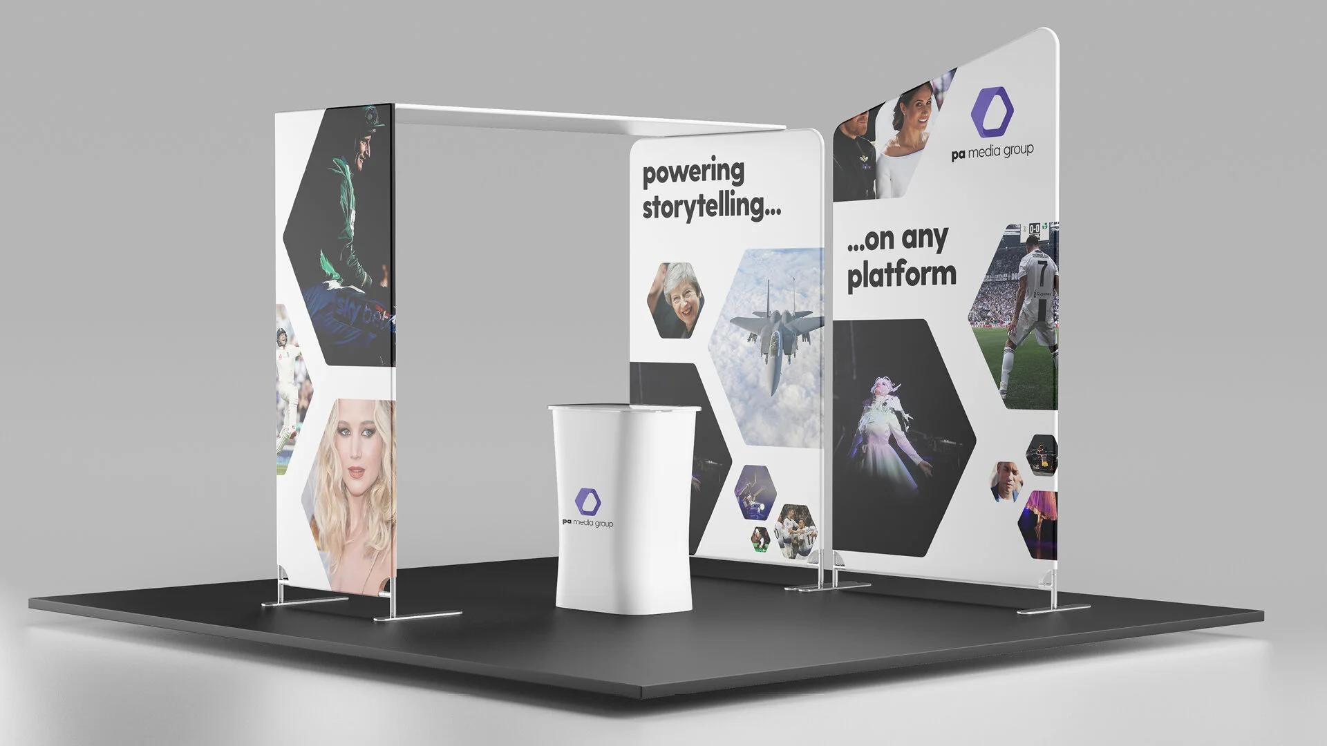
Some examples of the visual identity in use.
Product icons
The Group has a suite of digital products, and each one needed a visual identity of its own.
Office illustrations
Illustrations of the Group’s office buildings.


